SKH Custom ADF Component
Tips
Don't forget to...
> Add meta to jspx/jsf for responsive mode activation
<af:document>
 ...
 <f:facet name="metaContainer">
   <f:verbatim>
     <meta name="viewport" content="width=device-width, initial-scale=1, minimum-scale=1"/>
   </f:verbatim>
 </f:facet>
</af:document>
> Import bootstrap and fontawesome resources in jspx/jsf page
download bootstrap 5 - download fontawesome 6
<af:resource type="css" source="/resources/vendors/bootstrap-5.0.2/css/bootstrap.min.css"/>
<af:resource type="css" source="/resources/vendors/fontawesome6pro/css/all.css"/>
Components
depends on bootstrap 5
Add xmlns:skh="https://skhcodebook.com/snippetdetails/8mVsoSeHprPDLTxtiObH" to root tag.
<f:view .. xmlns:skh="https://skhcodebook.com/snippetdetails/8mVsoSeHprPDLTxtiObH">
ADF Faces Components
Enchance adf-faces components by using bootstrap for appling responsive
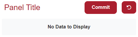
Panel Header with Inline Title
af|panelHeader
- Property fwClass must have special css class predefined in skin file

ListView Expanded
af|listView
- Responsive details and buttons
- Can expand area has more details

Custom Components
Using jsp:html tags and bootstrap
Panel Header Responsive
custom
- Custom component simulate af|panelHeader but responsive
Summary Card
custom

Bootstrap Card
bootstrap
- This is pure bootstrap card


Comments
Post a Comment